Northern California Allied Trades (NCAT) provides advocacy, education and legislative support for construction members, currently two trade specialty groups: Northern California Glass and Finishing Contractors (NCGFC) and Northern California Glass Management Association (NCMGA).
Project Background
The construction industry is changing. A younger, more diverse workforce embraces technology and new ways of working efficiently. Attitudes toward education and advocacy are shifting rapidly.
NCAT needed a new brand story that simultaneously appealed to the new mindset of incoming members yet respected the traditional roots of the trades and industry veterans.
What we set out to do
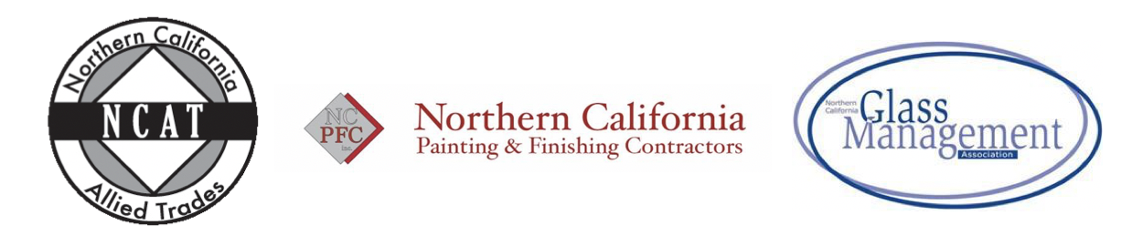
NCAT and its allied painting and glass organizations were outdated, busy, and ununified.
The new brand architecture had to convey the family linkage between the three entities; each reinforcing and complementing the whole, while retaining separate identities.
The new branding needed to be simplified, modernized, and relatable to both the old guard and new and future generations.
“We are changing and we are here for you.”
– The overall message from NCAT to its Membership
A new family of logos
GBW created a new identity system that communicates alignment yet independence; that respects history yet embraces the future.
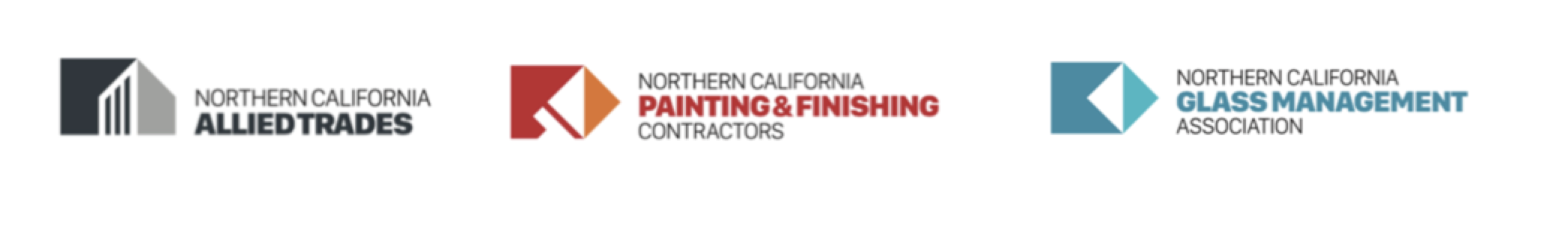
The new identity system is scalable to leverage the visual footprint-based icon design as more trades join the family.
The design is rooted in brand equities, which we co-created in a brand strategy workshop:
- Strength and Service
- Collaborative and Relevant
- Contemporary and Nimble
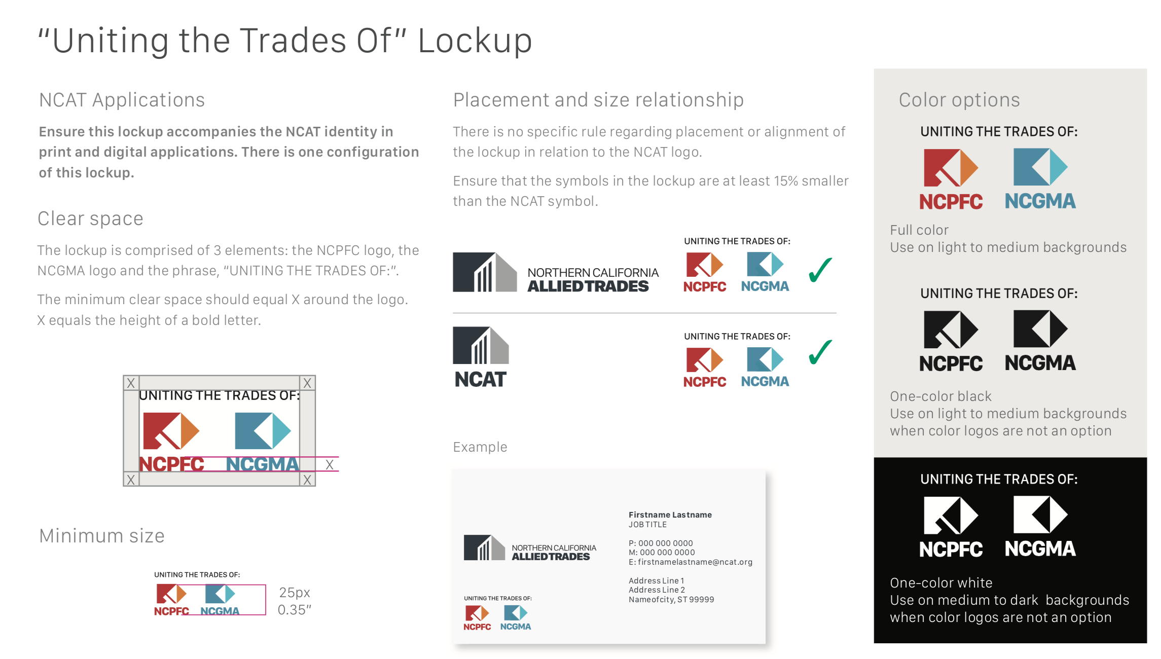
The new identity system is clean, bold, and contemporary. NCAT presents as a monolith pointing upwards, with white spaces creating openings for members to join in. The NCPFC and NCMGA logos feature right-facing arrows pointing to the future. And all three marks are rooted in the same footprint – providing a framework that unifies and that can scale.
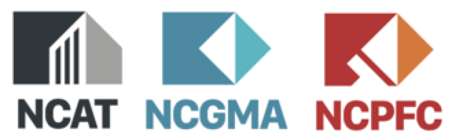
Acronym versions were created for flexibility in application.
Symbols can stand-alone
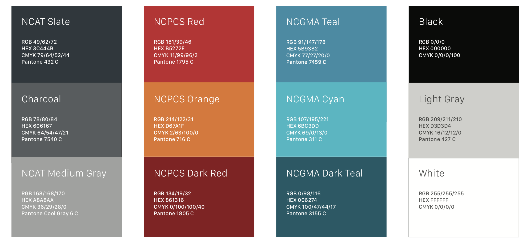
Color Palette
Neutral black-and white for the parent brand allows the sub-brands which it serves to be in the lead. Red for paint and blue for glass leverage color equites previously established for the respective trades.
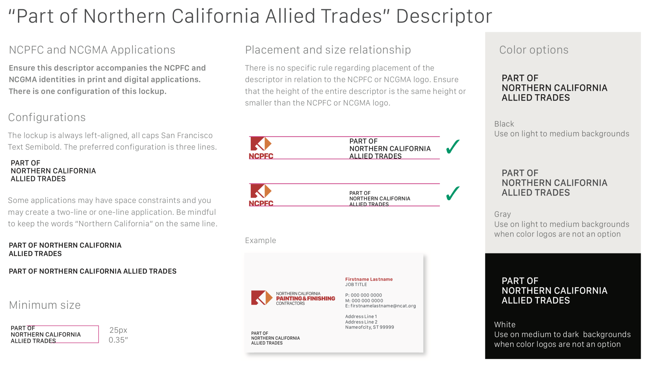
The New Brand Architecture
A copy and graphic system shows how the brands are related. It conveys three distinct but interconnected brands, using anchor text to show their interdependence and independence.
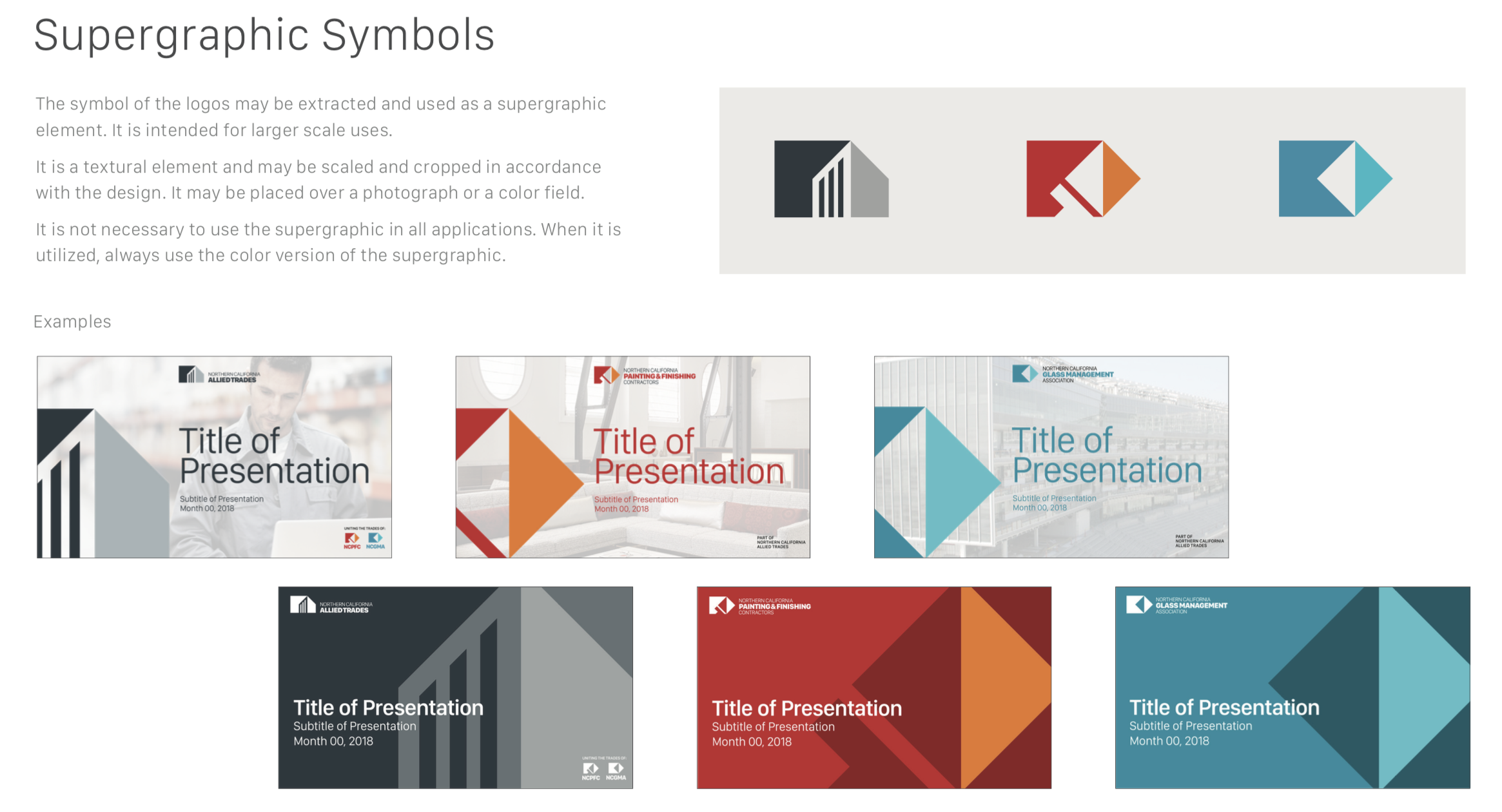
Symbols as a Graphic Connector
The core symbols blow up and crop, to create a bold, unifying graphic system.
Key Messaging
One sentence, one paragraph, proof points and catch phrases speak to current and future members and influencers. Messages position NCAT as a valuable resource for the advocacy, advanced skills, knowledge and tools finishing trade contractors need to do business in today’s shifting marketplace.
Updated Websites
Once the new architecture and visual identity was established, it was time to pass the baton to our digital agency partner, MarkerSeven, who applied the new messaging, graphics, and color to refresh the websites.

alliedtrades.org website
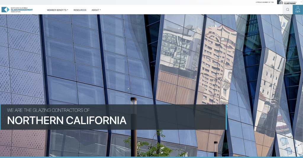
ncgma.org website
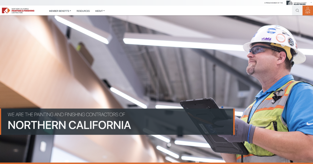
ncpfc.org website
Mary Loumeau, Director of Marketing, Northern California Allied Trades
“The logo redesign, and how the family system of logos work together, establishes us in the forefront of the construction industry. GBW really listens to what the client is asking for. They over-deliver, and everything they’ve produced is excellent.”
Team:
Strategy: Shannon Riordan and Caroline McNally
Designer: John Ledwith
Writer: Susan Reid
Website Design and Build: Marker Seven
Ready to solve your own brand challenges? Get in touch! LetsTalk@GlobalBrandWorks.com