For Sutherland Global, a 38,000 employee, process consulting firm in 120 countries, it was time to rebrand in order to show clients that they were not just in the business of outsourcing.
Our rebrand mandates were:
- Be unabashedly modern to match their ambitions and client list (Amazon, Uber, and Google among them)
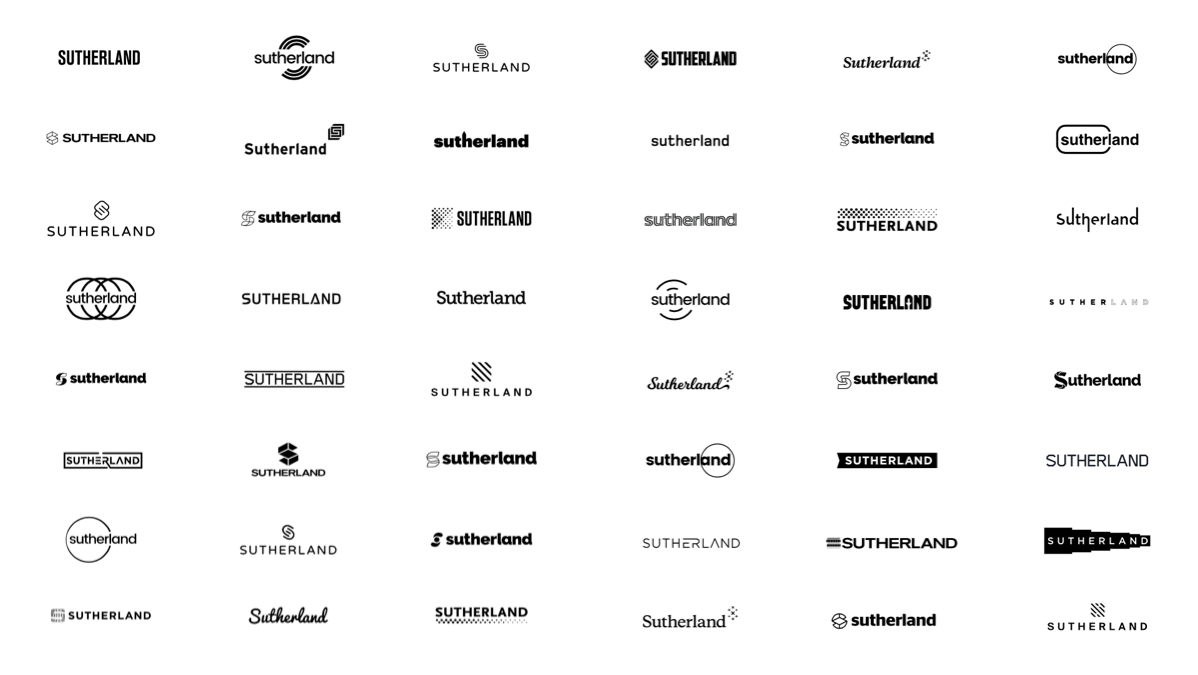
- Leverage the equity in the name by incorporating the S into an icon
- Reference to their most important brand tenet: the human touch
- Be rational, more telegraphic versus abstract, and emotive.
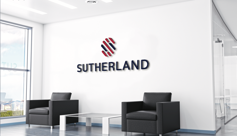
The result: An identity rooted in a human fingerprint, but which also morphs into letter S.
The logo combines the precision and rigor of process with the usability and ease of design thinking.
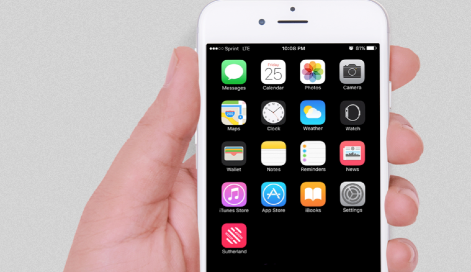
The “S icon” can stand alone, and also be used as a super-graphic to tie external touch points together:
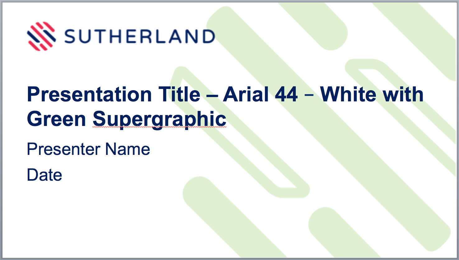
We developed a custom PowerPoint template with 48 pages of master and pre-designed slides:
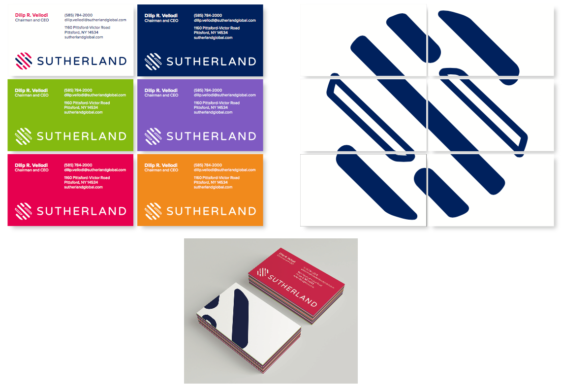
Business card design embraces the notion of teamwork, with the supergraphic coming together as a puzzle:
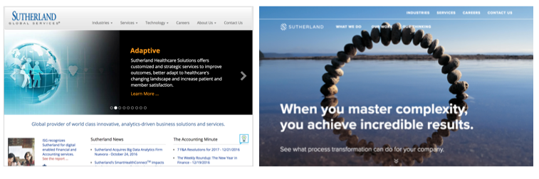
Here is the website home page, before and after:
The resulting full visual identity system, including typography, palette, imagery style photography, and brand voice, left Sutherland poised for the future in a rapidly changing marketplace.

And guess what else: we did it in 4 months! When we were hired by CMO Ben Stuart, he asked for a branding agency local, small and mighty. And that we were!
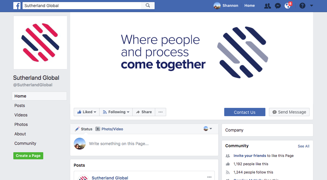
And check out this FB post from an employee’s excited daughter. We were thrilled to see this!
Learn more about Sutherland at: https://www.sutherlandglobal.com/
Team:
Strategy: Shannon Riordan and Caroline McNally
Designer: John Ledwith
Writer: Brad Hennig