What is GBW’s “Brand in a Box?”
As they say, big things come in small packages. Brand in a Box provides the essential elements of a full branding initiative, but it streamlines the process to get results faster.
We originally created Brand in a Box at the request of a venture capital firm who wanted to offer their Series A portfolio start-up companies a way to establish their brand story and key elements quickly, without a huge investment. Because early stage companies tend to pivot, a process was needed that was cost-efficient and agile.
We examined every step of our full branding process to find ways to simplify and expedite. With Brand in a Box:
- The client takes a more active role in completing tasks, such as completing an intake form instead of a marketplace or competitive report or end-user research.
- The client commits to fewer rounds of review/feedback throughout the creative processes.
- Client feedback for each round of each deliverable is due in 24 hours. Faster decision-making on naming, logo design, visual identity, messaging, and animation keeps the project on track (with no loss in quality).
Our strategic and creative work always relies on deep listening. Brand in a Box, like all projects, includes a workshop plus advice and support on how to justify the ROI to leadership and internal teams.

We keep it simple by offering two fixed-price packages, plus Add-Ons. Clicking on the “+” symbol reveals more detail about each deliverable using examples for a sample brand we invented, called Chillixirs.

Everyone works from a detailed timeline. We not only show what GBW will be working on each week, we provide explicit direction on what the client must do/provide to stay on time and on budget. Since most Brand in a Box clients are new to branding, this helps them to understand the process and the commitment involved (on both sides).
Our latest Brand in a Box client: Lykas
Lykas came to us with a unique idea, a whole lot of passion, a compelling founder’s story, and a name. They needed to move quickly and decisively to establish the brand story, messaging, and visual identity. A perfect fit for Brand in a Box.
The founder, Dave O’Mara, is a CFP, Investor, and Tax Specialist. Raised by a single mom, he saw how she, and some people of her generation were intimidated by the concept of financial planning. He began to notice that even now, many people from other generations and various life circumstances, have been ignored by the traditional financial services industry, leaving them interested in learning, but not knowing where to start.
Third party research showed that some people even had the preconceived notion: “Financial Planning is not for people like me.”
The idea behind Lykas is to make financial information accessible, affordable and empowering for everyone. Instead of just another financial advisory service, Lykas is a financially empowering community. It’s a whole new model of financial resource that combines cutting-edge technology, easy-to-understand content, practical expertise, and nonjudgmental support.
Lykas Members (note they are not called clients) receive:
- An actionable financial plan, with no obligation to invest
- Access to reliable financial knowledge (videos, blogs, documents)
- Access to a broad network of financial experts
- A supportive community

Developing the Brand Platform
We always start by listening. For Lykas, we listened to the competition, the marketplace, and company leadership in order to develop content for a co-creation workshop, conducted over Zoom. Out of that, we developed the Lykas Brand Platform.
The elements we share here show how GBW brought into focus this innovative shift in financial services paradigm and gives a sense of what members can expect from Lykas.

Sometimes saying what something is not says more about what it is.
Good ideas come from all places.
The concept behind the Lykas logo was the brainchild of the founder., David O’Mara. The sense of freedom and joy— but most of all confidence—one feels when riding a bike hands-free is an overarching emotional benefit the brand delivers.
Unique in the financial services space, the gender-neutral bike rider speaks to the brand elements of accessibility, user-friendly, witty, welcoming, and straightforward. He/she/they also epitomize the vast diversity of people who now have a resource for financial knowledge and empowerment.
A rich purple differentiates the brand from the “sea-of-sameness blue” we see in so many financial services brands. The dark tone lends gravitas. It is not whimsical, stuffy, evocative of royalty, or elite, as some purple hues can convey.

A Unique Graphic Device: 22° Line and Pattern. A graphic element in the visual identity system is the 22° line derived from the trails on the logo symbol. When used without the symbol it connotes a sense of dynamic movement and steady direction.

The 22° line is applied with consistency, yet flexibility: It may be used as a single element or as a pattern – overlapping or sequenced. It may contain text or an image. It may connect two graphic areas such as photo and text, photo and color field, etc. It can be used on feature pages, covers, and focal areas of web pages and applications.
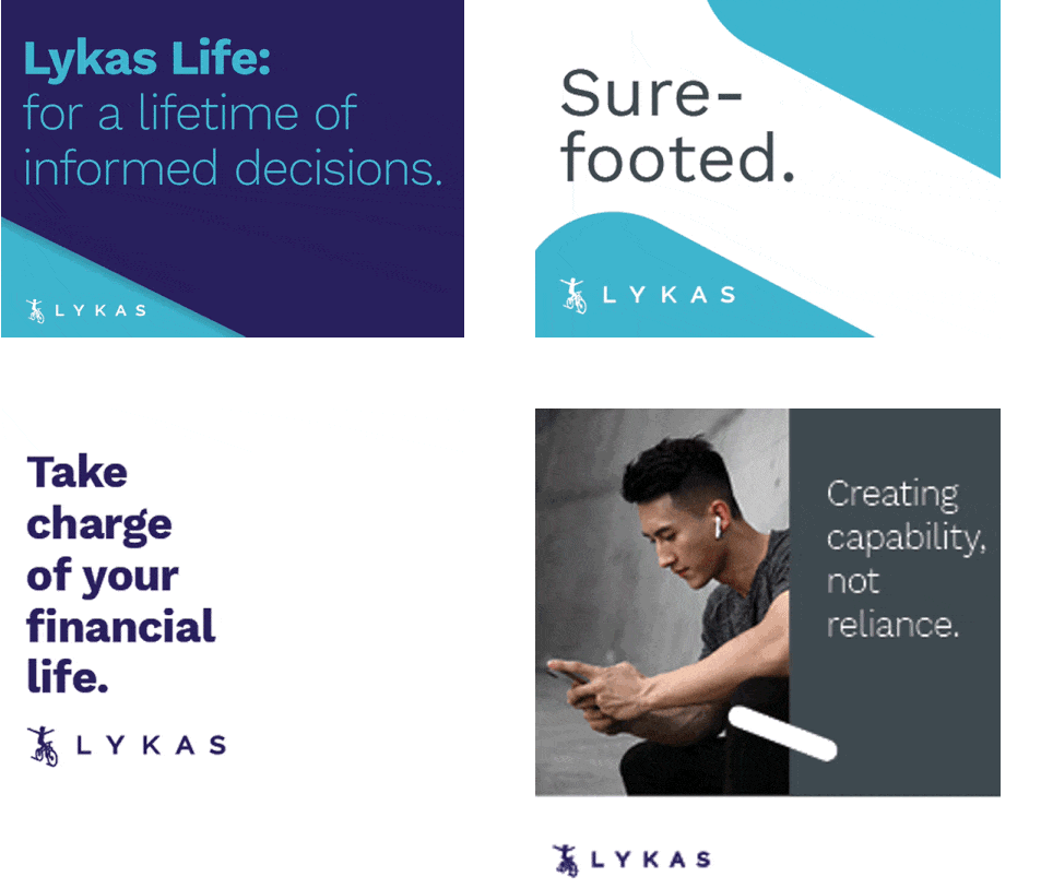
Putting it all together with messaging. Words bring the Lykas brand to life. In fact, the term “Lykas Life” quickly became a central theme. Besides its friendly double “L” alliteration, it creates an indelible link between the Lykas community and the member. Lykas Life is something to aspire to and is achievable.

Lykas is the means of improving one’s financial life by providing the accessible resources and support to make informed decisions. A not-so-subtle invitation to join Lykas is to be joining a like-minded community, “like us.” (We couldn’t resist.)
Can you recall the moment when you first rode hands-free? When you finally decided to go for it, take the plunge, believe in yourself, and just do it? That is the story behind the the Lykas brand and animation. Lykas is about capability, not reliance. Lykas sets you free by giving you the confidence to take control of your financial life.
“Once GBW’s guidelines and messaging were in hand, developing our launch materials has been a breeze! GBW worked fast, and in the spirit of true partnership. Investing in our brand story up front was one of the best decisions we made.”
– Eric Cotte, Principal, Lykas, Inc.
Click here for the full client testimonial.
|
Caroline McNally |
Shannon Riordan |
|
Claudia Angulo |
John Ledwith |
|
Susan Reid |
Martin Ilievski |