FinTech brand LendKey, (via our fabulous partners at Archie Group), engaged Global Brand Works to brand their new B2B start-up platform for credit union buyers and sellers of mortgage loans.
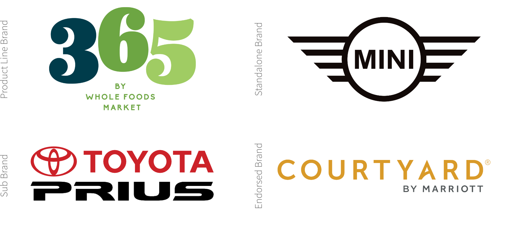
Our first order of business was defining the brand architecture. Should the LendKey offering be a product line (like Whole Foods’ 365 brands), a stand-alone brand (like Mini is to BMW), a sub-brand (like Toyota Prius), or an endorsed brand (like Courtyard by Marriott)?
To answer this question we started with an in-depth deep dive in which we interviewed stakeholders, analyzed the competition, and debated the pros and cons of each option in a workshop.
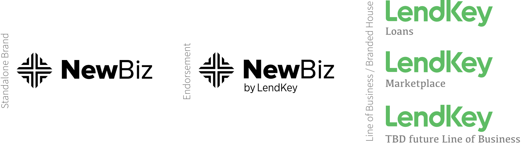
The solution was clear: the new brand would be endorsed by the parent, LendKey.
The new entity gets to leverage the existing trust the LendKey brand has established among its target audience: students, and its marketplace: student loans.
Plus, the new entity could also step out with a new and unique solution, disrupting a different marketplace: an exchange for mortgage loans, among a new target audience: credit unions.
These were the options that up for debate (using a placeholder name and logo); the middle one is a mock-up of the chosen endorsement brand approach.
With brand architecture settled, we established a set of environmental principles at the core of the brand development brief:
- The offering would be positioned as a platform
- The benefit is market access
- The proof points emphasize forward-flow deal-making
- The functional equities deliver unique benefits such as volume certainty and diversification
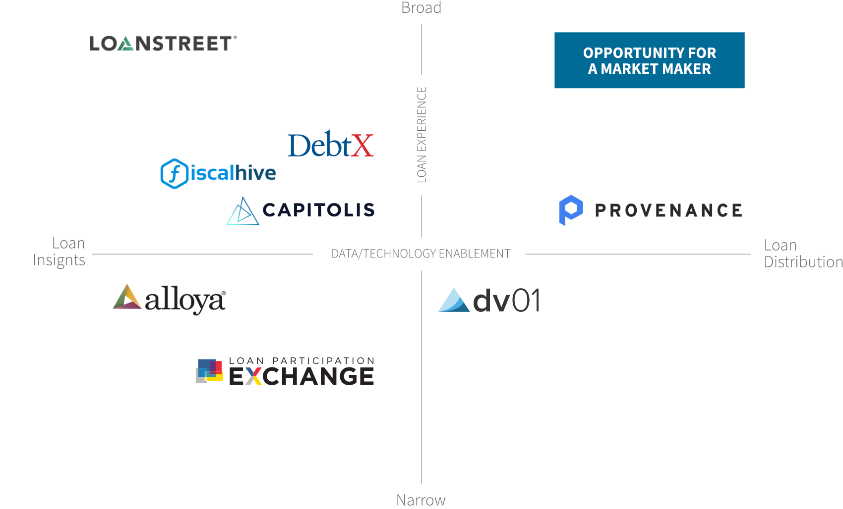
When we mapped the competitors against loan experience and data/technology enablement, we found that magical white space in the upper right quadrant: the positioning as a Market Maker.
The next challenge: a name worthy of the platform’s Market Maker ambitions
Now the creative begins! Here’s a peek into our sausage-making that clients rarely see: We start by casting a wide net – very wide, and bring in a team of creatives who bring different perspectives to the challenge that meet the brief.
Of the 500 or so names we initially generate, we cull to about 250 for the first round. Once we are down to the final 10, usually after 3-4 rounds of review, we conduct a pre-legal clearance to identify levels of risk and eliminate any that are unavailable.
(We are not lawyers though, and the task of final legal clearance is on our client’s legal department.) — for more detail on our step-by-step process click here.
When clearing a name we review finalists against the following criteria:
- Patent and trademarks for all relevant geographic areas in the proper trademark categories
- URL ownership among the top extensions
- A “by hand” Google search 3 pages down-Social media handle use-Cultural and linguistics check for other meanings or confusion

These are the actual names generated in round 1.
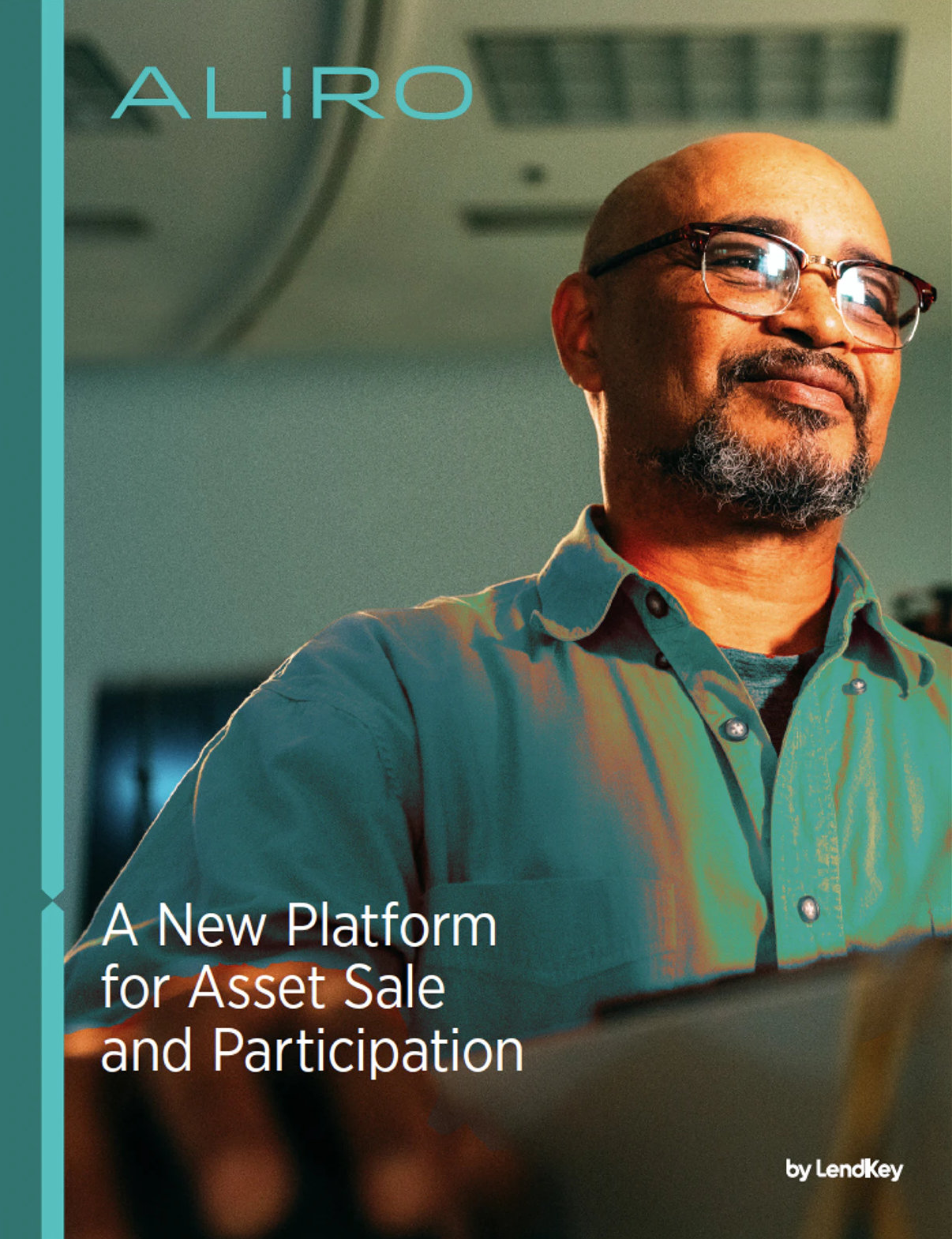
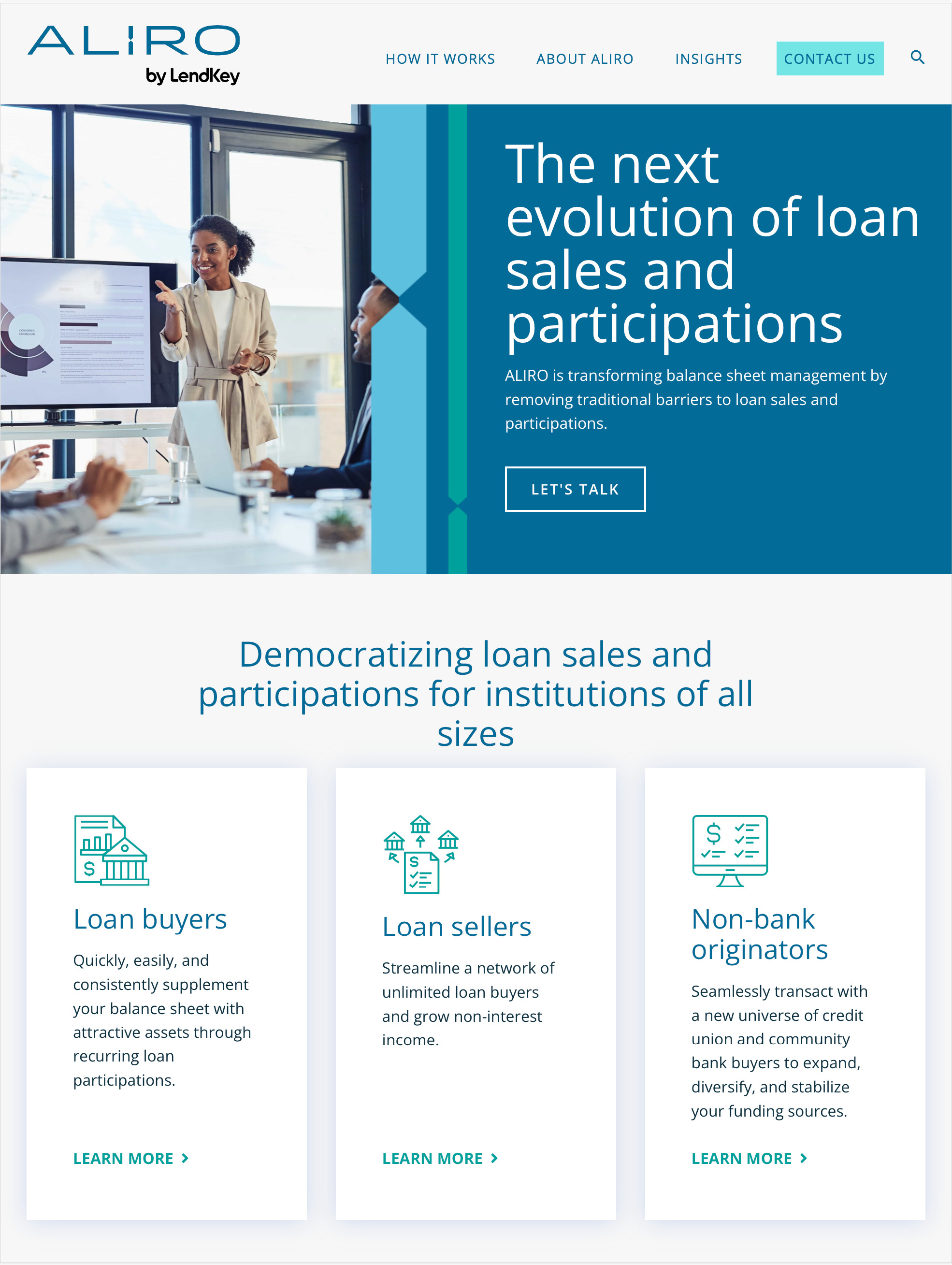
And the winner: ALIRO. Aliro evokes brightness (i.e., smart, enlightening). And the name fits nicely with its parent: “Aliro by LendKey” rolls off the tongue. Bonus: In Esperanto it means “access.” It is also visually pleasing and balanced.
How do we make Aliro stand out? By developing a visual identity system rooted in story.
The concept behind the Aliro platform is one of balance and equilibrium, which is the strategic spirit behind the design of the logo. The “I” stands firmly in the center of the word, like a fulcrum, balancing the letters on either side. AL and RO take up equal weight and mass to deliver a feeling of balance.
The bold stance and kerning of the wordmark gives the logo a feeling of presence and stability – crucial to any brand in the financial services space, particularly a start-up. The deep teal lends gravitas and complements the parent brand’s green palette.
The I of the wordmark is also the core of a larger visual system, which we coined the “Point of Equilibrium.” The distinct intersection of two points leaving just the right amount of negative space, tells the story of buyers and sellers meeting, collaborating, and transacting, to create balance and liquidity.![]()
The guidelines deliver a framework with flexibility that can be applied with and without photography, or as “light touch” applications leveraging just color or typography.
When used as a static pattern or in digital animation, The Point of Equilibrium represents another strategic element of the brand story: community. The lines enter from top and bottom, to represent buyers and sellers meeting at various points to transact on the platform.

Whether animated or static, application of different sized lines represent the size and range of deals that Aliro can facilitate.
Global Brand Works delivered a name and identity that instantly commands attention. Aliro shines boldly and modernly against more established brands.
“The Global Brand Works team operates with flexibility, focus, and heart. Their approach to naming and visual identity is clearly rooted in many of years of experience. They have honed a methodology that delivers powerful and differentiating branding, quickly and efficiently.”
– Devin Hughes, VP, Business Development, LendKey Technologies
Click here for the full client testimonial.
|
Shannon Riordan |
Kelli Peterson & Archie Group |
|
SuperScript Marketing |
John Ledwith |